
Day 16: Comprehensive EDA and Data Visualization in Python#
Objectives:#
Understand EDA Principles: Gain a deep understanding of Exploratory Data Analysis (EDA) principles and practices in data science.
Master Data Visualization Techniques: Learn a range of data visualization techniques to uncover patterns, trends, and insights.
Apply Statistics: Utilize descriptive and inferential statistics to summarize and draw inferences from the dataset.
Implement Best Practices: Adopt best practices in EDA and data visualization for clear, accurate, and ethical representation of data.
Hands-on Python Exercises: Conduct a thorough EDA using the Kaggle Wine Quality Dataset.
Prerequisites#
Intermediate Python, Pandas, NumPy, Seaborn, and Scikit-Learn skills.
Basic understanding of statistical concepts and linear algebra.
Dataset: 100daysofml/100daysofml.github.io
# Import necessary libraries
import pandas as pd
import matplotlib.pyplot as plt
import seaborn as sns
from scipy import stats
# Load the dataset
wine_data = pd.read_csv('wine_quality.csv')
1. Advanced Introduction to Exploratory Data Analysis (EDA)#
Importance and Goals: Understand the data, spot mistakes, check assumptions, and find insights. EDA’s primary goal is to gain insight into a dataset and understand its underlying structure.
Best Practices: Start with simple visualizations and statistics before moving to complex analyses. Be mindful of missing or erroneous data and its impact on your analysis.
2. Mastering Data Visualization Techniques#
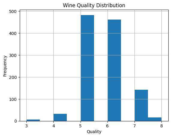
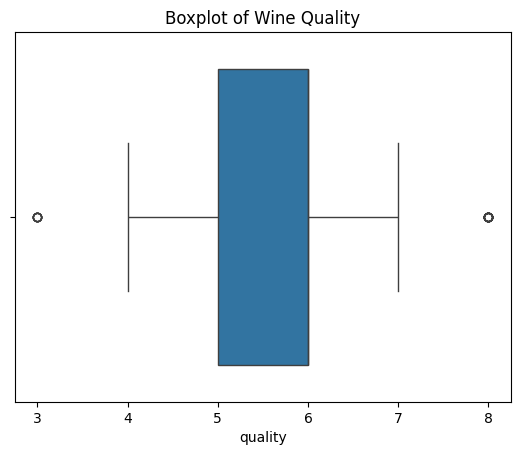
Histograms and Boxplots:#
Meaning: Histograms show the frequency distribution of a variable; boxplots provide a visual summary of the distribution.
Best Practices: Choose an appropriate number of bins for histograms. For boxplots, be aware of outliers.
Do’s and Don’ts: Do label axes clearly; don’t ignore unusual patterns.
Python Code:
# Histogram
wine_data['quality'].hist(bins=10)
plt.title('Wine Quality Distribution')
plt.xlabel('Quality')
plt.ylabel('Frequency')
plt.show()

# Boxplot
import seaborn as sns
sns.boxplot(x='quality', data=wine_data)
plt.title('Boxplot of Wine Quality')
plt.show()
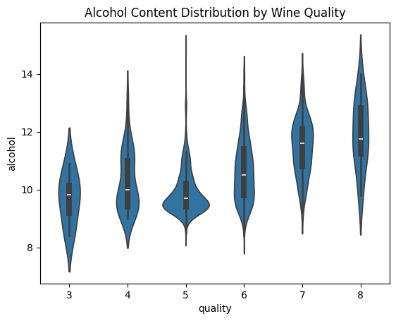
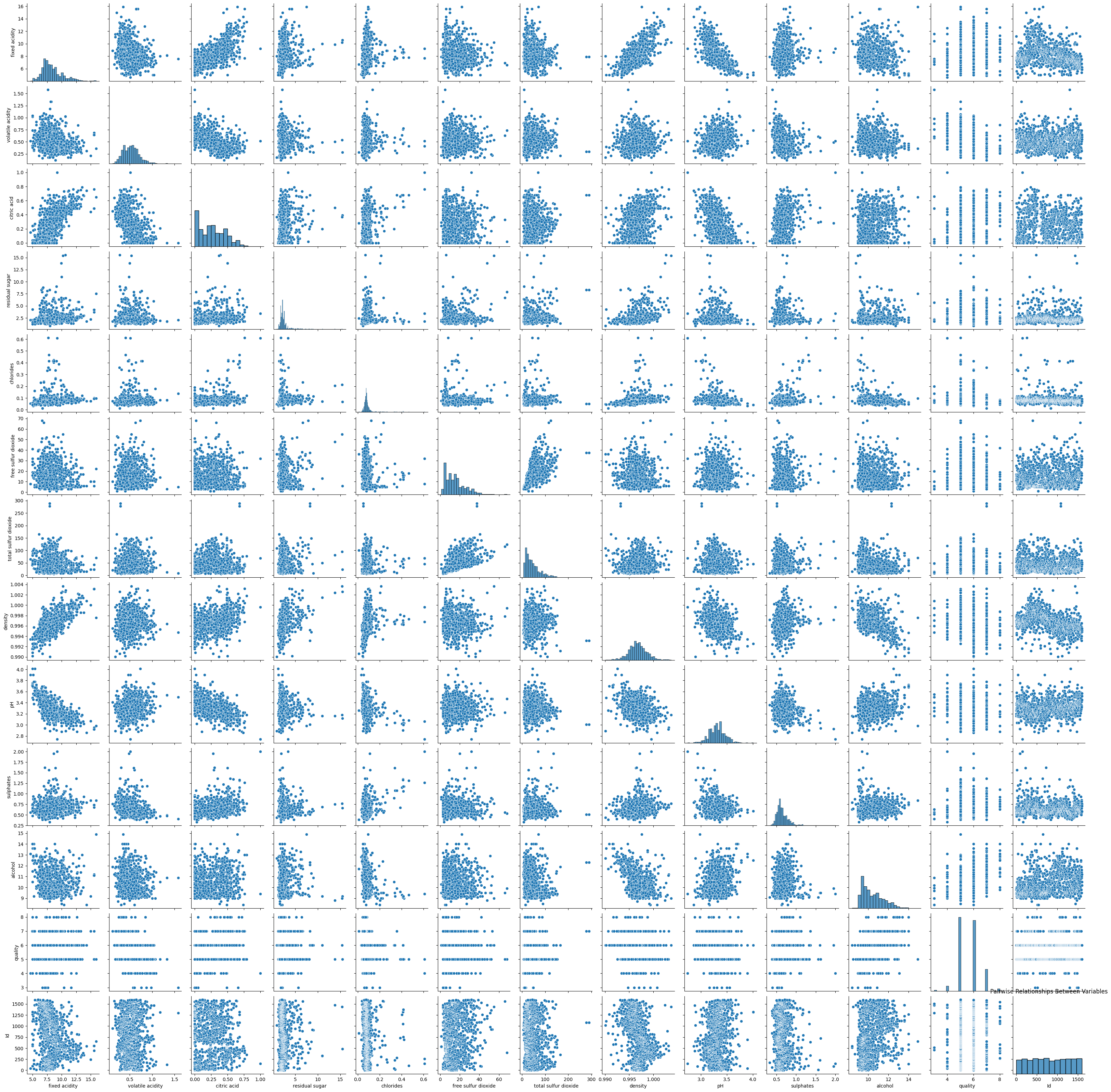
Violin Plots and Pair Plots:#
Violin Plots: Combine boxplot and kernel density estimation.
Pair Plots: Show pair-wise relationships between variables.
Best Practices: Use violin plots for comparing distributions; use pair plots for preliminary investigation of relationships.
Do’s and Don’ts: Do interpret carefully, keeping in mind possible overplotting in pair plots.
Python Code:
# Violin Plot
sns.violinplot(x='quality', y='alcohol', data=wine_data)
plt.title('Alcohol Content Distribution by Wine Quality')
plt.show()

# Pair Plot
sns.pairplot(wine_data)
plt.title('Pairwise Relationships Between Variables')
plt.show()
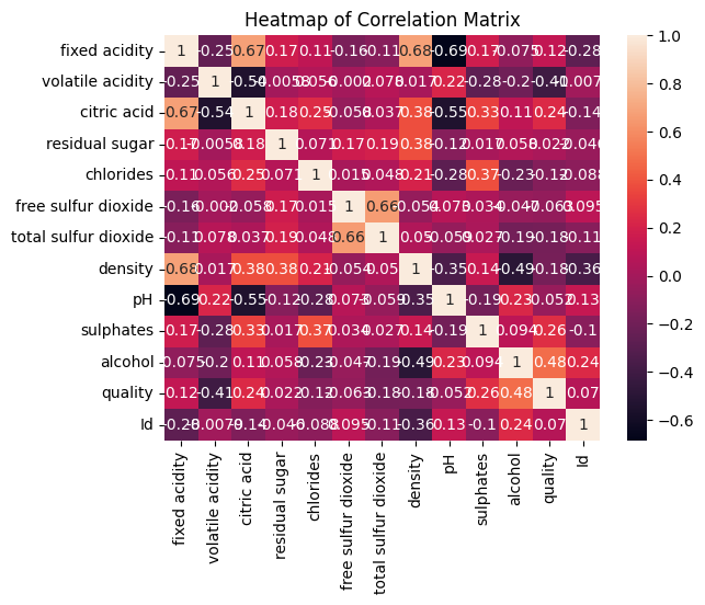
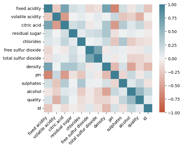
Heatmaps:#
Meaning: Visualize data matrices, commonly used for correlation matrices or time-series data.
Best Practices: Use diverging color schemes for variables that diverge around a meaningful point (e.g., zero).
Do’s and Don’ts: Don’t use too many color categories; it can make the heatmap hard to interpret.
Python Code:
correlation_matrix = wine_data.corr()
sns.heatmap(correlation_matrix, annot=True)
plt.title('Heatmap of Correlation Matrix')
plt.show()
corr = wine_data.corr()
ax = sns.heatmap(
    corr,
    vmin=-1, vmax=1, center=0,
    cmap=sns.diverging_palette(20, 220, n=200),
    square=True
)
ax.set_xticklabels(
    ax.get_xticklabels(),
    rotation=45,
    horizontalalignment='right'
);
3. Applying Descriptive Statistics#
Mean, Median, Mode, Variance, Standard Deviation:#
Meaning: Measures of central tendency and spread.
Best Practices: Use appropriate measures based on data distribution. Mean is sensitive to outliers, while median is more robust.
Python Activities: Calculating these statistics for the Wine Quality Dataset.
Python Code:
print(f"Mean: {wine_data['quality'].mean()}")
print(f"Median: {wine_data['quality'].median()}")
print(f"Mode: {wine_data['quality'].mode()[0]}")
print(f"Variance: {wine_data['quality'].var()}")
print(f"Standard Deviation: {wine_data['quality'].std()}")
Mean: 5.657042869641295
Median: 6.0
Mode: 5
Variance: 0.6493527188260838
Standard Deviation: 0.8058242481000952
Skewness and Kurtosis:#
Meaning: Skewness measures the asymmetry; kurtosis measures the tailedness.
Best Practices: Use skewness to understand the asymmetry and kurtosis to understand the extremity of data values.
Python Activities: Calculating skewness and kurtosis for the Wine Quality Dataset.
Python Code:
print(f"Skewness: {wine_data['quality'].skew()}")
print(f"Kurtosis: {wine_data['quality'].kurtosis()}")
Skewness: 0.2867917004538591
Kurtosis: 0.3146639385893346
4. Introduction to Inferential Statistics#
Sampling Distributions and the Central Limit Theorem:#
Meaning: Central Limit Theorem states that the sampling distribution of the sample mean will be normal or nearly normal if the sample size is large enough.
Best Practices: Understand sample size implications and the distribution of your data.
Hypothesis Testing:#
Meaning: A method for testing a claim or hypothesis about a parameter in a population, using data measured in a sample.
Best Practices: Clearly define null and alternative hypotheses, choose an appropriate significance level, and understand the type I and type II errors.
Python Activity: Conduct a simple t-test on selected variables from the Wine Quality Dataset.
Python Code:
# Conducting a t-test
t_statistic, p_value = stats.ttest_1samp(wine_data['alcohol'], popmean=10)
print(f"T-Statistic: {t_statistic}, P-value: {p_value}")
T-Statistic: 13.811761283140333, P-value: 3.0619222323076622e-40
5. Comprehensive Hands-On Activities#
Descriptive and Inferential Statistical Analysis:#
Objective: Summarize and describe the dataset’s features and make predictions or inferences.
Python Activities: Implement and interpret advanced statistical analyses using Python.
Advanced Data Visualization:#
Objective: Visually represent the data in an informative and compelling manner.
Python Activities: Create advanced visualizations like violin plots, pair plots, and heatmaps.
Best Practices:#
Ensure that visualizations are accessible, with appropriate labeling and legends.
Be cautious of drawing conclusions from coincidences or spurious relationships.
Ethically represent the data, avoiding misleading representations.
This lesson blends theoretical knowledge with practical application, ensuring students not only learn Python coding and statistical concepts but also develop a deep understanding of how to conduct EDA effectively and responsibly. The focus on best practices ensures that students are not only proficient in data analysis but also aware of the ethical implications and the importance of clear and accurate data representation.
6. Homework Assignment and Best Practices#
Task:#
Conduct a comprehensive EDA on the Wine Quality Dataset. Apply both statistical and visualization techniques.
Report Writing: Compile findings, visualizations, and interpretations in a structured report, reflecting insights gained.
Instructions for Homework Report:#
Introduction:
Briefly describe the dataset and the objectives of your EDA.
Data Overview:
Present the structure of the dataset (number of features, number of observations).
Show the first few rows of the dataset.
Descriptive Statistics:
Include the output of
.describe().Discuss any initial observations about mean, median, and range of certain features.
Visualization Analysis:
Include histograms and discuss the distribution of different features.
Include boxplots and discuss any potential relationships between features and wine quality.
Include the heatmap of the correlation matrix and discuss any strong correlations observed.
Inferential Statistics:
Include the results of skewness, kurtosis, and hypothesis testing.
Discuss any implications of the results of these tests.
Conclusions:
Summarize the main insights gained from your EDA.
Discuss any potential implications of these insights for wine producers or sellers.
Appendix:
Include your Python code.
Remember to structure your report clearly and present your findings in a manner that is easy to understand. Use visualizations effectively to support your analysis and be critical about the insights you draw from the data.
Additional Resources (Comprehensive EDA and Data Visualization)#
https://datasciencedojo.com/blog/eda-exploratory-data-analysis/